Structural Elements
- Panel
-
A panel is a block element that has the ability to load data asynchronously when a
srcattribute is set (same-origin policy restricted).The Markup:
- Tab Box
-
A container used to display a set of tabbed pages of elements. A row of tabs is displayed at the top of tabbox which may be used to switch between each page. The tabbox may contain a
tabselement, a container fortabelements, and atabpanelselement, which serves as a container fortabpanelelements.Tab 1 Tab 2 Tab 3 Tabboxes are great for showing users only the content they need to see, while providing users an easy way to access additional content on-demand.
Examples of use-cases for tabboxes include: a set of step-wise directions, grouping like content elements together, or as a building block for a tabbed viewing interface in a mobile web app.
In short, tabboxes are pretty freaking cool, and when you pair them with CSS animations/transitions, you can do things with a few styles that used to take a ton of JavaScript and custom code.
The Markup:
Tab 1 Tab 2 Tab 3 Panel 1 Panel 2 Panel 3 - Accordion
-
An accordion is a collection of panels containing content separated by toggler elements.
Toggler 1 Tabboxes are great for showing users only the content they need to see, while providing users an easy way to access additional content on-demand
Toggler 2 Examples of use-cases for tabboxes include: a set of step-wise directions, grouping like content elements together, or as a building block for a tabbed viewing interface in a mobile web app.
Toggler 3 In short, tabboxes are pretty freaking cool, and when you pair them with CSS animations/transitions, you can do things with a few styles that used to take a ton of JavaScript and custom code.
The Markup:
Toggler 1 Panel 1Toggler 2 Panel 2Toggler 3 Panel 3 - Slide Box
-
A container that allows animated transitions between content panes. Slide Box supports horizontal and vertical transitions.
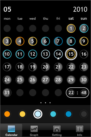
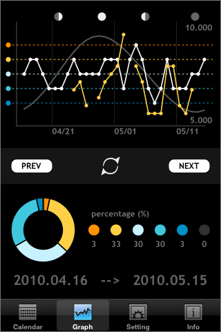
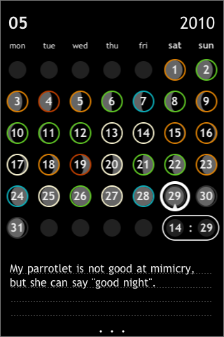
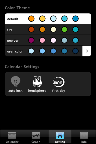
The Markup:
Slide 1 Slide 2 Slide 3 - Flip Box
-
This element allows you to place two elements back-to-back and then flip between them.


The Markup:
Side 1Side 2 - Modal
-
The
modalelement can be used to show notices or secondary content above the z-level of the page.The Markup:
YOUR CONTENT HERE
Media Elements
- Map
-
The map element automatically loads a Leaflet/OpenStreet map centered on either the user's location, a set of lat/long coordinates provided via attribute, or an internal default (Mountain View, CA - had to pick somewhere!)
The Markup:
Input Elements
- Autosuggest
-
An autosuggest input provides automated hints and completion of textual value based on keyboard input.
The Markup:
Navigation Elements
- Pager
-
A pager element that allows you set properties and it will do the rest.
The Markup:
- Action Bar
-
An iconified navigation that fire user-defined actions.